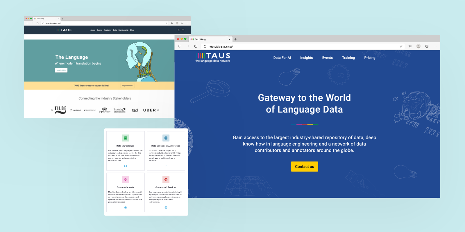
It’s been a long way since TAUS was founded in 2005 as a think tank with a mission to help businesses automate and innovate translations. The language industry and our customer base have evolved over the years, so we’ve evolved with them.
Today, as the language data network, our offering is centered around language data for AI and NLP-powered data services. We offer the largest industry-shared repository of data, deep know-how in language engineering, and a network of language workers around the globe. Our mission also became more concrete - empower global enterprises and their service and technology providers with data solutions that allow them to go beyond 100 languages.
Why Change the Look?
To make sure our visual identity reflects our new offering and mission, our brand had to follow suit in this transformation. The transition from think tank to the language data network was not an easy one. With such a strong legacy in thought leadership, transforming into a provider of end-to-end language data solutions was a big leap both for TAUS and our customers.
Therefore, the main goal of these brand changes was to show you how much we’ve grown and how much more value we have in store for our users.
Branding for Clarity
We wanted the new message to be clear: TAUS is no longer the gateway to knowledge and resources, but to language data and advanced data services. That meant reducing the content, simplifying the storyline and the look and feel of our website, shortening the user journeys, and focusing them on one thing - data.
Doing More with Less
The focus on data required a complete change of narrative. Sure, we would have loved to tell the whole story of how we got there and all the things we’ve previously done, but we know that our customers have limited time. Therefore, we’ve made sure to show our new services and benefits within the first scroll on all pages, reduce the number of headings and highlighted features, and front-load the ways to find the solution to your problem or get in touch with us.
New Hero Color: Dark Blue
Those of you who know TAUS, know that we’ve always used bold colors, and a lot of them. We used colors to express our creativity, inclusivity, and passion for collaboration. The five main TAUS colors are bright and energetic which makes them hard to combine with other colors. So, for our brand assets that required full-color backgrounds or color highlights on elements, we’ve chosen a new dark shade of blue. It is meant to add depth to our brand elements and give them a modern, edgy look. We didn’t want to lose flexibility and diversity in our choices, so we’ve kept the shades of TAUS colors for highlights.
Simplified Illustrations
The most recognizable part of the TAUS design have always been the colorful hand-drawn illustrations. As a think tank, our goal was to drive the industry agenda forward and that involved coming up with complex and unique concepts like the Modern Translation Pipeline, world-readiness, fixing the translation ecosystem, and more. Most of them were accompanied by a set of thought-provoking illustrations. Since tangible commercial solutions became our primary focus over concepts, it was time to switch from conceptual to purposeful and have fewer illustrations. Now, TAUS artwork is one-colored, outlined, and used with purpose.
What’s New?
Over the years, we evolved through listening to our customers. This redesign, therefore, included some restructuring as well as launching new ways for you to interact with us. Here are the highlights:
Staying True to Our Values
Our legacy is what has gotten us this far, so this re-design doesn’t mean we are giving it up. Our vision for 2021 highlights some of our long-lasting values like disintermediation and desilofication of data with platforms like TAUS Data Marketplace, while adding a few new ones that have become increasingly important in the era of AI: ethical responsibility in AI, tackling digital inequality, and fair pay for the new line of workers. It is this simplification of our offering, presentation, and messaging that will create more room for us to focus on delivering on those values and promises moving forward.
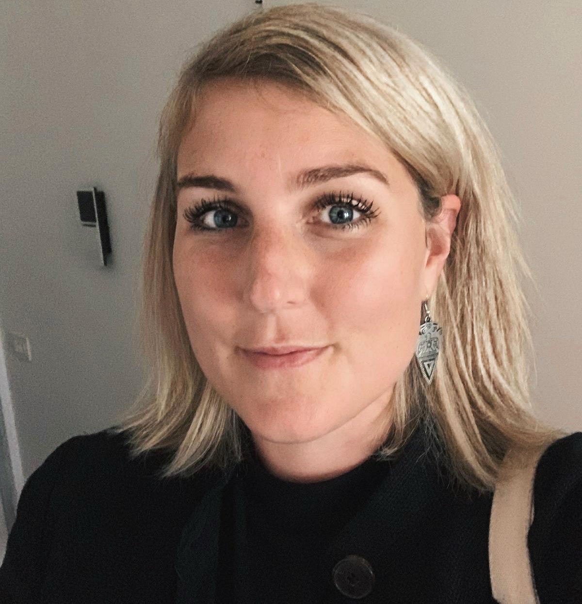
Milica is a marketing professional with over 10 years in the field. As TAUS Head of Product Marketing she manages the positioning and commercialization of TAUS data services and products, as well as the development of taus.net. Before joining TAUS in 2017, she worked in various roles at Booking.com, including localization management, project management, and content marketing. Milica holds two MAs in Dutch Language and Literature, from the University of Belgrade and Leiden University. She is passionate about continuously inventing new ways to teach languages.